


Why is Amazon Search Bar on Bottom?
In recent years, Amazon has made a significant change to its mobile app layout by moving the search bar to the bottom of the screen. This shift has sparked a lot of discussion and raised questions about the reasoning behind this decision. In this article, we will explore why Amazon has chosen to place the search bar at the bottom of the screen and discuss the implications of this design change.
The User Experience Perspective
One possible explanation for moving the search bar to the bottom is to enhance the overall user experience. By placing the search bar within easy reach of users’ thumbs, Amazon aims to make it more convenient for customers to search for products. This is especially beneficial for users who prefer one-handed navigation or have larger devices that may be challenging to operate with one hand. With the search bar easily accessible at the bottom of the screen, users can quickly enter their search queries without having to stretch their thumbs to reach the top of the screen.
Seamless Navigation and Persistent Search
Another potential reason for this design change is to create a seamless navigation experience for users. With the search bar persistently displayed at the bottom of the screen, users can easily access it no matter where they are on the page. This means that even as users scroll through product listings or browse different categories, the search bar remains visible and accessible, allowing for quick and effortless searching. This persistent search feature ensures that users can find what they’re looking for without having to navigate back to the top of the screen.
User Feedback and Continuous Improvement
It’s important to note that Amazon values user feedback and takes it into consideration when making design decisions. The decision to move the search bar to the bottom may have been influenced by feedback from users who expressed a preference for having the search bar in a more easily accessible location. By actively listening to user input and incorporating it into their design choices, Amazon demonstrates a commitment to continuously improving the user experience.
Conclusion
In conclusion, the decision to place the search bar on the bottom of the screen in Amazon’s mobile app can be attributed to user experience considerations, seamless navigation, and the company’s dedication to incorporating user feedback. While this change may take some users by surprise initially, it ultimately aims to enhance the overall convenience and ease of use for customers. As Amazon continues to evolve its app design, it is essential to keep an open mind and embrace these changes as part of the company’s commitment to providing an excellent user experience.
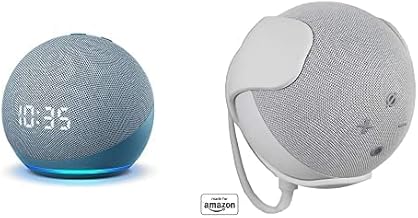
As for our recommended product related to the topic, we suggest the Amazon Echo Dot (4th Generation). The Echo Dot is a popular and well-regarded smart speaker that offers voice-controlled support, music streaming capabilities, and access to various smart home devices. With its sleek design and advanced features, the Echo Dot is an excellent addition to any modern home.


